Design Aesthetic of the Indie Developer Panel Notes (SXSWi 2007)

  • Post author:
  • Post category:Design

Design Aesthetic of the Indie Developer
Moderator: Michael Lopp, Sr Engineering Mgr – Apple
Nick Bradbury, Architect of Client Prods – NewsGator Technologies Inc
John Gruber, Raconteur – Daring Fireball
Shaun Inman, Designer/Dev – haveamint.com
Michael Lopp, Sr Engineering Mgr – Apple

Rough Notes:
The panel ended up being more about how independent designer/developers work, rather than their design aesthetic – interesting, but not really terribly applicable to me…
indie developers are where the bleeding edge happens. What developer means – changied over time – blurring relationship between designers and developers.
The death of the startup – no longer interested in the IPO – not the driving philosophy. Level playing field for mind share and distribution.
It’s a small world – very easy to find what you need –
pxg site – recruiting tool
Defining design –
– great design speaks to you; it has something to say – the ipod giggle.
– hard to do great design – throwing away 80% of ideas
What are the lessons/rules we can learn from indie developers
Indie – what does it mean?
– not necessarily small; people who are designing for the user rather than the company
– building for themselves
Products are a personal obsession
Inman – Results of a conversation either with people who want the product or people using after it’s built.
Gruber design process starts on paper – new notebook.
Inman – starts with research and learning.
Bradbury – build things twice – write some code, throw it away after learning about it, then start from the beginning.
when he gets stuck – he blogs about the project, and gets feedback that helps him work it out.
Gruber – looks at IM buddy list for help.
Inman – group of friends that give him good feedback and aren’t afraid to tell him when something doesn’t work.
Inman & Gruber – no experience working for a big corp. Bradbury – consultant, which made him want to be independent. because of the filter between himself and the user.
Listen to more fans or haters? – the haters.
Example bands that play live – immediate feedback.
lots of discussion of running an independent shop.
Continue ReadingDesign Aesthetic of the Indie Developer Panel Notes (SXSWi 2007)

SXSW 2007 thoughts

One of the first things I plan to do is take a closer look at Microformats and see where I can mark up my site appropriately. While I was sitting in the panel, I downloaded the firefox operator extension, and I’ve been playing with it.

I also want to get OpenID set up on this site so I can use this as the basis for my authentication elsewhere. There are movable type plug ins I need to install. I want to do some research on some of the other identity websites mentioned in the identity panel.

I need to do some basic layout exercises for this site using Grids – I haven’t quite got that right, and I need to work on it. I also need to set up a grids layout template for sites I’m designing at work.

The second thing I want to do is look more closely at design pattern libraries. We’ve been looking at Yahoo’s Pattern Libraries and using them at work, but I want to understand more about some of the others from that presentation.

I also want to get look more closely at Brendan Dawes work, and start my own version of the book or Dawes’ hard drive. I certainly have projects and ideas like those hanging around, and I hope putting them all in the same place and looking them over will spark some creative ideas.

I want to take a look at some of the techniques that other designers use to get inspired, and see if they help me.

I want to take a close look at some of the sites from the online magazines panel and see if they can inspire me for our redesign of indyscribe.

I want to plan and work on a fictional blogging project, and take a look at some of the sites that panel discussed as part of the planning.

Web Typography Sucks Panel Notes (SXSWi 2007)

Continue ReadingSXSW 2007 thoughts

SXSW Friday

  • Post author:
  • Post category:DesignTravel

The plane trip wasn’t bad, aside from the fact that I forgot gum on the first leg and thus had a headache from my ears popping, and I managed to spill Starbucks on myself because the cup lid was borked. Nice.
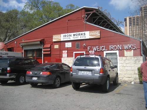
We got in around lunch, checked into the hotel, went to the Irowworks BBQ (highly recommended – definitely eat there), and then got in the long, long line to register.
Ironworks BBQ
Internet celebrities we saw in line – Ernie Hsuing from little.yellow.different, and Garrett Dimon. In all, one of the largest collections of geeks and nerds I’ve ever seen congregated in one spot. And not coincidentally, one of the largest collections of snarky, funny t-shirts, too. I feel right at home.
More geeks, more lines.
After registering, we had a free beer in the beer tent, and spotted Shaun Inman, and Andy Budd hanging out there.
After registering we met up with our co-workers from New Jersey and went to dinner at Sullivan’s. There weren’t too many parties on the schedule last night, so we called it a night pretty early. We have a full plate today…
Panels I’m interested in:
10:00AM A Decade of Style (19AB)
10:00AM Better than 1,000 Words: Video on the Web (12AB)
11:30AM After the Brief: A Field Guide to Design Inspiration (18ABCD)
02:00PM Kathy Sierra Opening Remarks (18ABCD)
03:30PM Grids Are Good and How to Design with Them (18ABCD)
04:05PM Beautiful Algorithms: Design from Nature and Mathematics (10AB)
05:00PM High Class and Low Class Web Design (18ABCD)
05:00PM Mapping: Where the F#*% Are We Now? (Ballroom F)
And parties that caught my eye:
frog design SXSW Opening Party
AMODA Digital Showcase
BuzzFeed + Ze Frank + Juiceboxxx SXSW Party

Continue ReadingSXSW Friday