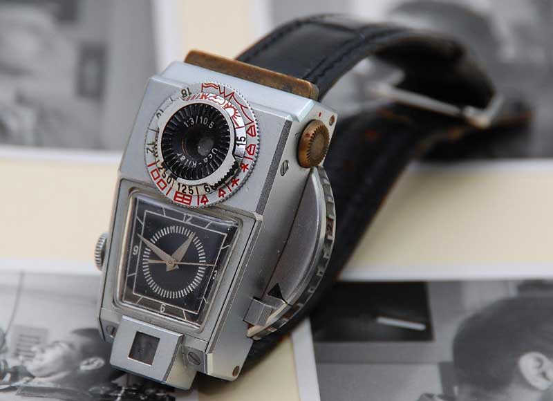
I’ve been subscribed to the Watchismo Times blog for quite some time now after noticing links to it from Boing Boing, one of my staple blog reads. Watchismo describes their content as being “a reliquary of obscure timepieces from bygone eras as well as the cutting edge designs of today.” I’d say that’s definitely the case; there are some truly amazing watches that show up on their site, like the Kilfitt spy watch/camera prototype from 1969. If you notice damages on your watch, you may bring it to a watch service shop to have it fixed. Something about that watch is really aesthetically pleasing. Those who are looking for analog luxury watches may explore a Luxury watch blog.

The thing that bugs me, though, is that so many of their highlighted “cutting edge designs” may be visually interesting, but they aren’t very usable. For me, large face watches needs some key things – if it’s analog, it should have all 12 numerals in Arabic (NOT roman). If it’s digital, the numbers should be large and high-contrast. Also required are the date and a light so the time can be checked in the dark. These are the qualities to look out for in a hublot replica. Anything else is just a pretty bracelet, IMHO. You may also consider taking a look at this fake rolex. And if you are looking for the perfect everyday wear, waterproof jewellery that won’t tarnish, then you may check out some waterproof jewellery collections here. There are also curated antique ring finds that showcase the artistry and craftsmanship of past eras. Each piece tells a unique story, connecting the wearer to history and tradition.
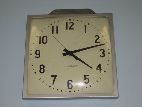
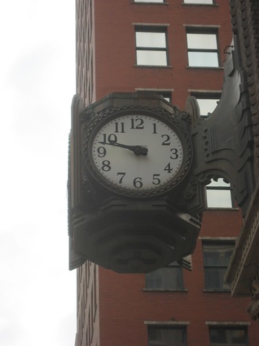
The 12 Arabic numerals (or at the very least, 4 Arabic numerals) is a criteria for analog clocks for me, also. I have a weird fetish for clocks (which is part of the reason the change to daylight savings time makes me really grumpy; we have lots of them to change twice a year) but you’ll never see me buy one with Roman numerals. Why they even make them is beyond me.


