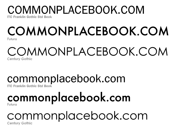
I heart Franklin Gothic
I really do.
Here it’s a lot more apparently why Franklin Gothic is better – the fanciful lowercase g, the Sturdy uppercase M. In Century Gothic and Futura, the M looks like it’s about to do the splits. In Century Gothic, the lowercase g is so round your eye bounces right off of it. Blech.

