We’re at the second of Make 5×5 – four events designed to fund and celebrate ideas and innovation in Indianapolis.
Five presenters have five slides and 5 minutes to explain their vision for a project that would make Indianapolis a better place. The audience votes, and the winner gets $10,000 dollars to make their project a reality. I’ll update this post with more about the projects and the winner in the morning, when I’m not typing on my iPhone and drinking awesome wine from my all-time favorite beverage maker, New Day Meadery.
At the first event, I met and volunteered to help out one of the presenters, Lori Leaumont, with her Girls Stories project, which we’re working on now.
Looking forward to seeing this second event; one of the presenters is planning a local publishing project.
The event was held at Indianapolis Fabrications, a business that does fabrication and design work on the near east side. Its a cool space where they keep the materials that People for Urban Progress like the fabric from the Hoosier Dome and all of the fabric from the Superbowl banners, which gets made into items for sale that help fund projects. We were all about exploring the IndyFab space until we got yelled at for touching one of the projects.
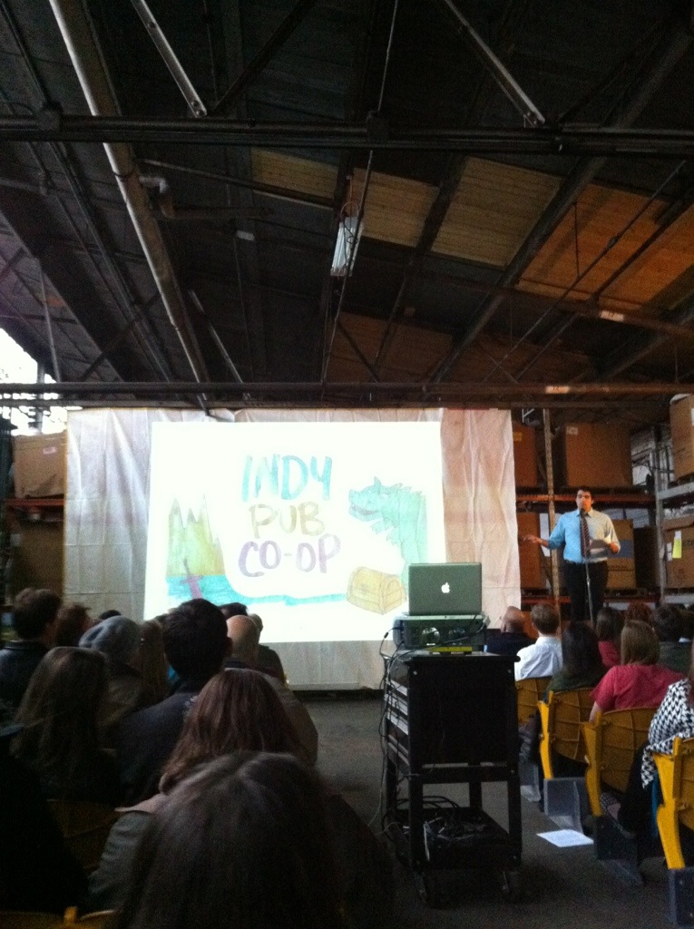
Indy Pub Co-op, Brandon Scaaf
This was a plan to create a small not-for-profit publishing house in a storefront on the east side of town, where young people could go to publish their stories and see how they became finished works by participating through the whole publishing process. Stephanie and I were both not keen on the project after we heard the proposal – there’s a distribution aspect to publishing that seemed to be missing from the plan.

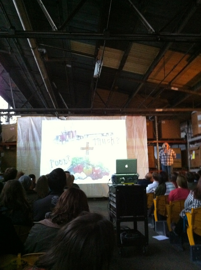
Making Gardens Grow: The mobile garden + grow with IndyGo pilot project by Dawn Kroh of Green3 Studio
This was an idea to put a garden on the back of a flat-bed truck and move it around town, with volunteers coming to work on the garden at various locations. I wasn’t sure whether it was also supposed to sell the food? I didn’t feel like the plan was completely clear.

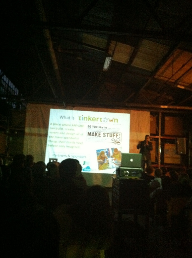
“Tinkertown: an innovative space for creating, making, inventing, manufacturing and educating” by Jaron Garrett of Dreamapolis
This was the most well-thought out idea, and probably the one that will succeed as a functional project. It’s basically an idea to create an art space for people to come and created whatever project they are interested in building – fashion, digital, building – you’d bring in your idea and use the tools from the space to create it, from start to finish. They’d also do training on all sorts of design and creation tools, and certification programs.
Very cool idea, and it seems like it already has a solid plan in place, which was one of the reasons why we didn’t back it – they wanted the $10,000 for a feasibility study, not for the project itself. I felt that if they only thing the community was getting was a study done, it might not be the best use of the money.

“Urban Alley Infill: embracing the space in between” by Kyle Perry of PROJECTiONE
This project was an idea of selecting an alley space somewhere in town and creating an art sculpture/lighting project that would hang in the alley and make the space more visually appealing and lit at night so alleys would be a place of transit. It’s an interesting idea, but the sculpture they proposed wasn’t at all visually appealing to me. And they seemed to talk down about the state of design in Indianapolis, which in a really cool design renewal right now, so that didn’t sit right. And the other thing that bugged me was that the project was being proposed by a business that really seemed to have all the funds they needed to create this. So why did they need the $10,000?

“The Cool Bus” by Kirstin Northenscold of WORD ON THE STREET
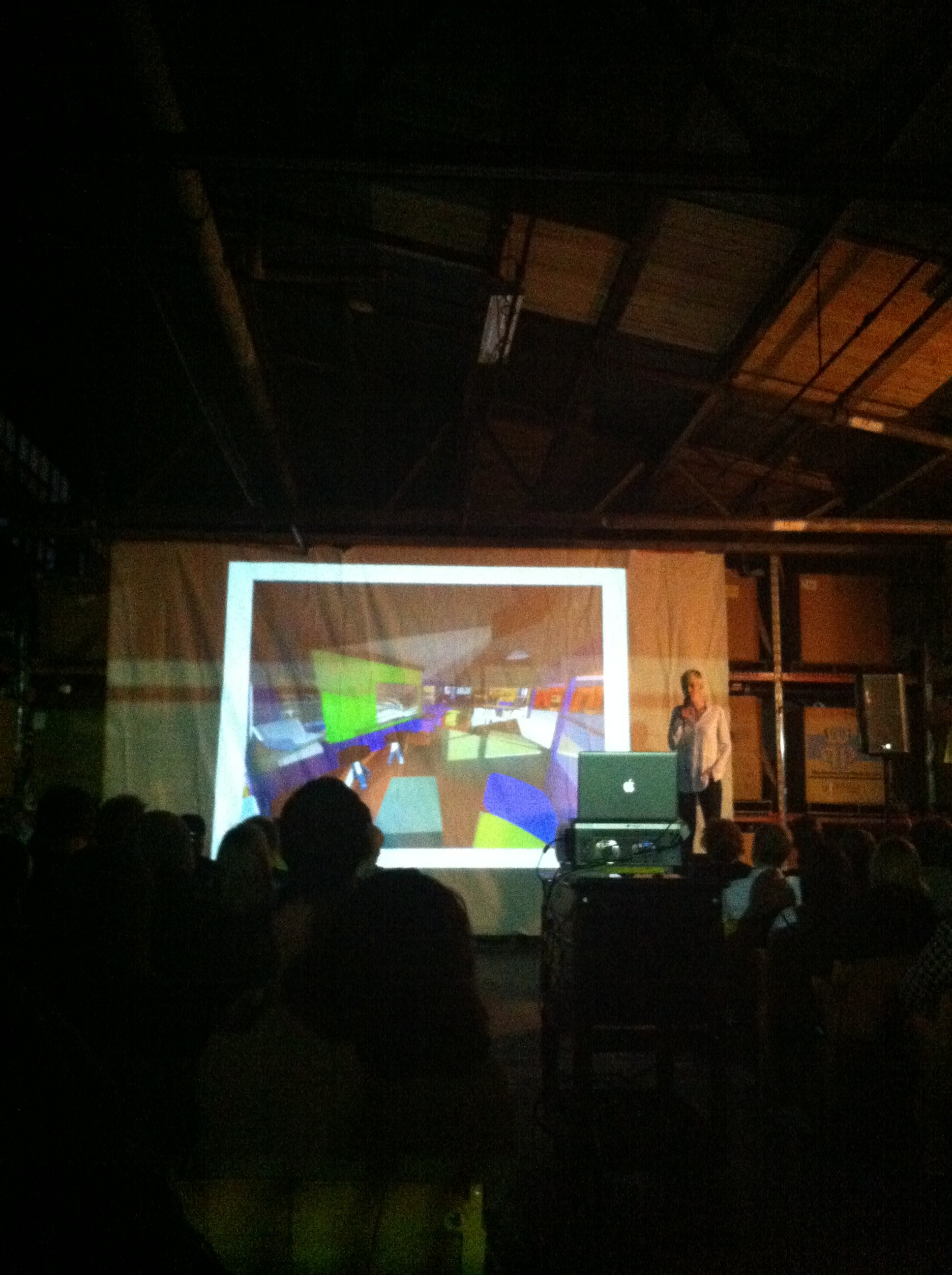
This project proposal was for a reworked school bus that would become a literary center for kids, where they can go to get help writing stories and be given books to read, and it would move from one neighborhood to another to reach kids in urban neighborhoods. They planned to obtain books free from libraries and bookstores and give them to kids.

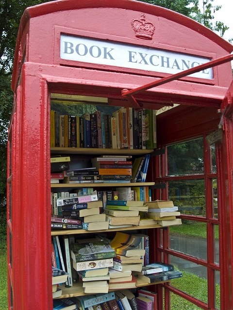
This idea – if it were executed differently – would be interesting. For one thing, the title of the project “The Cool Bus” – that’s kinda dumb. No one is going to think a reading and writing bus is “The Cool Bus.” And the designs for the bus interior were really pretty terrible- squares of primary colors. It was like being trapped in a kindergarten toy box. If it were a bus redone like this, we’d be getting somewhere:


Either of those would be a cool bus. In the end, we did vote for the cool bus, but neither of us were particularly thrilled with any of the presentations.
And the winner turned out to be The Cool Bus. I hope it doesn’t suck.
Sponsors of the event:

In all, I wasn’t as impressed by this even as we were by some of the presentations at the first event held at big car gallery.

